The project task involved doing a heuristic evaluation of the “Think&Link” application, followed by its UX ReDesign.
The project was done with Dr. Lakshmi T.G., who had designed and developed the Think&Link app as part of her Ph.D. thesis.
The task involved conducting a systematic heuristic evaluation as detailed in the usability goal-setting tool developed by Dr. Anirudha Joshi. The ReDesign was done using the tool Adobe XD with multiple iterations based on the feedback from the researcher.
Publication: Lakshmi, T. G., & Herold, P. C. (2019, December). Heuristic Evaluation and User Experience Redesign of’Think & Link’Learning Environment–A Case Study. In 2019 IEEE Tenth International Conference on Technology for Education (T4E) (pp. 166-169). IEEE.

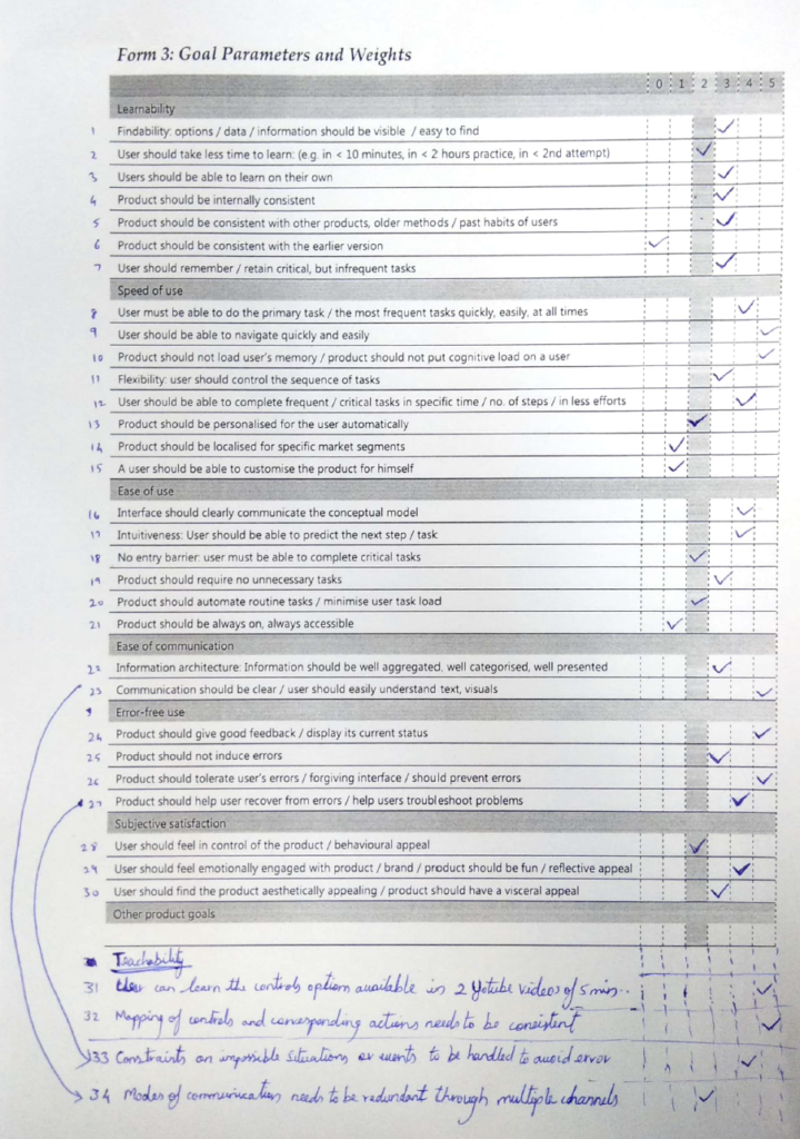
The process begins with creating product and user profiles to set usability goals. UGT originally lists 30 goals across six categories: learnability, speed, ease of use, communication, error-free use, and satisfaction. Four additional goals were added, and we assigned weights (0-5) to each goal based on priority and criticality, as shown in the figure below. Screens were then evaluated against these goals to identify any misalignments.

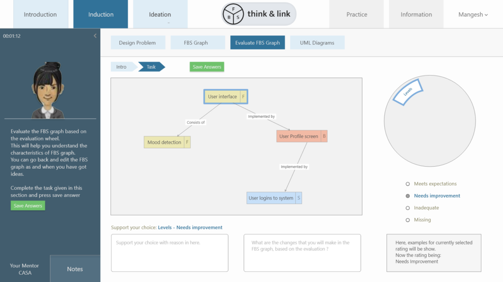
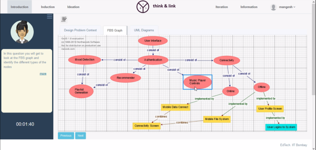
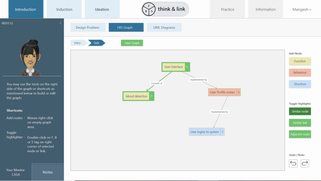
Design changes were made across multiple screens to meet the high-priority goals first. For example, the Figures below show the original vs. redesigned screen, noting misalignments under ‘Goal 9’. A key challenge here was revamping the navigation menu to improve learner comprehension, integrating next/previous buttons into the main tabs as a branched submenu, and labeling them contextually (intro/task) as per ‘Goal 23’.
Original Screen:

Redesigned Screen:

